Brand reset
For established teams that have outgrown their story, identity or digital experience and need a clearer system before the next stage of growth.
Typical engagement · 10–16 weeksWe build positioning, identities, digital experiences and motion systems for ambitious brands entering their next era.
Explore selected work↗02 / Capabilities
We join strategy, identity, digital and motion into one connected system — so the brand launches as an experience, not a folder of assets.

Three connected practices
Positioning, category thinking, naming, audience architecture, verbal worlds and launch narratives that give the brand a sharper reason to exist.
Visual identities, art direction, websites, digital products, design systems and campaign toolkits that stay recognisable across every surface.
Motion principles, 3D direction, launch films, product motion and spatial experiences that give the identity pace and personality.
How we engage
For established teams that have outgrown their story, identity or digital experience and need a clearer system before the next stage of growth.
Typical engagement · 10–16 weeksFrom strategic proposition to launch-ready identity, product language, website and motion toolkit — designed as one coordinated release.
Typical engagement · 12–20 weeksSenior creative partnership for internal teams navigating a product launch, campaign, redesign or period of rapid brand expansion.
Typical engagement · 4–12 weeksProof in practice
Have a meaningful change ahead?
Service / 01
We turn ambition, audience tension and competitive context into a clear strategic position people can understand, remember and act on.
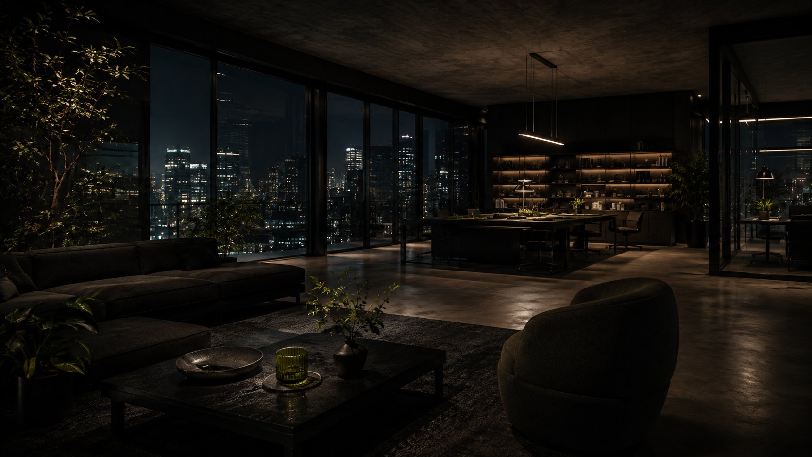
Best for new ventures, category shifts, scale-ups that have outgrown their story and established brands preparing a major repositioning.
Clarity is not simplification. It is choosing the idea that deserves to lead.
Our process
Leadership interviews, product immersion, customer signals and competitive context reveal where the real tension lives.
We identify the opportunity, define the audience logic and make the strategic choice explicit enough to guide creative work.
Positioning, narrative, naming and verbal principles turn the strategy into language teams can actually use.
We carry the strategy into identity, product, launch and internal rollout so it changes behaviour, not just presentations.
Need sharper positioning?
Service / 02
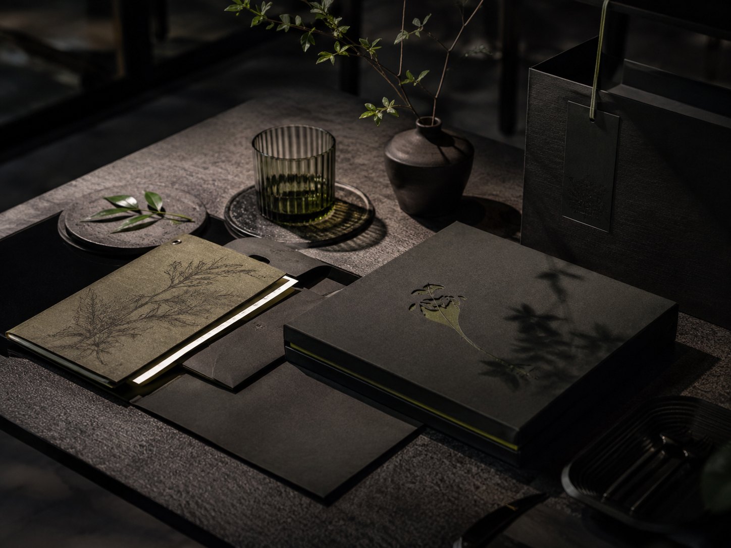
From a central idea to the smallest interaction, we create identities with enough discipline to scale and enough character to stay alive.
A strong identity should not collapse into one composition. We define rules for rhythm, hierarchy, image, typography, interaction and motion.
Distinctiveness comes from a small number of decisions repeated with conviction.

System thinking
We document not only the finished visual language, but the logic behind it — giving marketing, product and partner teams a system they can extend without slowly diluting it.
Design sequence
Several distinct ways the strategy could become visible, tested for meaning and recognisability.
We develop the strongest territory into a flexible language spanning core brand and digital behaviour.
Real pages, product screens, campaigns and motion tests expose weaknesses before guidelines are locked.
Templates, systems and documentation make the work practical for internal teams and external partners.
Building or rebuilding an identity?
Service / 03
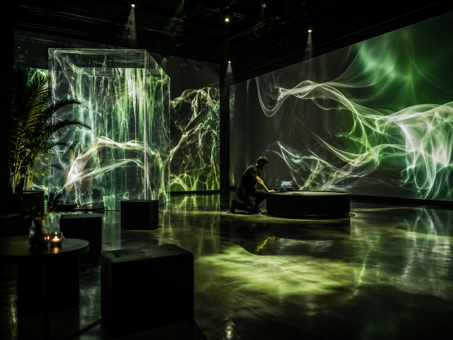
Motion, 3D and spatial rules transform a static identity into a world with pace, personality and a recognisable point of view.
We define movement early, then carry it through launch films, websites, interfaces, events and campaign moments so everything feels connected.
Motion is not decoration. It is part of the identity’s behaviour.
 Brand motion / rhythmic reveal
 Spatial / directional language
 Product / micro-interaction
Motion system
We define pace, energy, easing, transitions and compositional behaviours that express the strategic idea.
Hero transitions and signature sequences show the language at its most expressive.
Smaller motion patterns make product UI, social content and digital campaigns feel equally recognisable.
Templates, examples and production guidance make the motion system practical for teams to use repeatedly.
Need the brand to move?
03 / Selected work
A selection of strategy, identity, digital and motion projects across hospitality, technology, culture and emerging consumer brands.
 ← Selected work
Hospitality / Identity / Digital / 2026
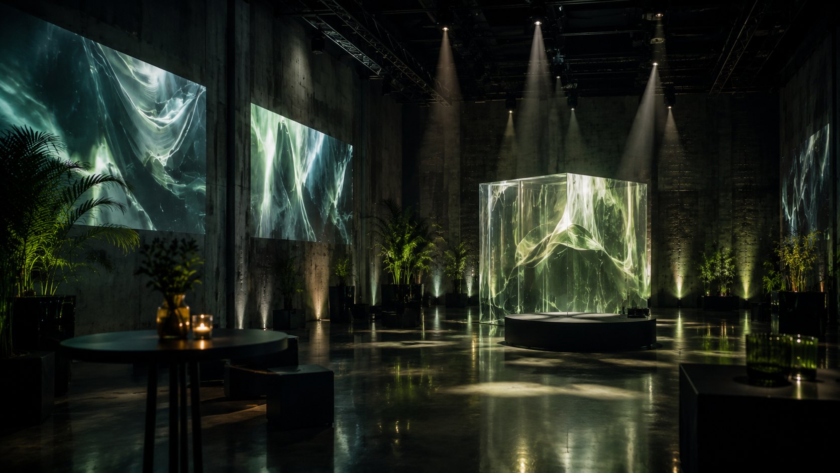
Nova House needed a language that felt calm without becoming anonymous. We created a flexible identity built from architectural rhythm, editorial typography and cinematic image direction.
The digital experience carries the same tension: generous space, precise transitions and moments of motion that make the brand feel alive without adding noise.
Every choice was designed to feel deliberate — never decorative.
The challenge
The category was full of familiar codes: serif logotypes, neutral photography and generic language about escape. We needed to preserve quietness while building something more proprietary. The answer was not more ornament, but a stricter rhythm and a more cinematic way of framing space.
 ← Selected work
Technology / Strategy / Product / 2026
We reduced a dense technology story to one memorable proposition, then built a modular visual system that could move between product, corporate and recruitment audiences.
Language became shorter, product narratives became visual, and the identity used controlled bursts of motion to make invisible infrastructure feel tangible.

The challenge
The business had several products, audiences and proof points competing for attention. Strategy established the single problem the company was best positioned to solve, creating a hierarchy that made every product story easier to understand.
← Selected workCulture / Editorial / Experience / 2025
Atlas needed a system flexible enough for hundreds of contributors. A clear typographic spine and adaptive grid give every story room while keeping the archive recognisable.
The digital experience makes discovery feel editorial rather than database-like, allowing visitors to move through themes, eras and connections without losing context.
← Selected workHealth / Strategy / Identity / 2026
Frame turns complex health signals into a clear sequence of next steps. The brand system uses measured contrast, precise language and calm product motion to reinforce a sense of control.
← Selected workObjects / Brand / Commerce / 2025
We built a visual language that lets form and material lead. The commerce experience stays minimal but expressive through typography, image pacing and subtle interaction.
← Selected workCulture / Editorial / Motion / 2025
Field Notes combines long-form research with a more dynamic browsing experience, using modular typography and motion cues to help readers move between related ideas.
04 / Studio
Neravo is an independent studio built around a compact senior team and a trusted network of specialists. The people in the room are the people doing the work.
How we work
Strategy and design happen together, not in separate departments. The people shaping the brief stay connected to the execution.
The work has to survive real teams, real channels and real pressure. We test it in context before we call it a system.
Every project should create a clear before and after for the business — in clarity, recognition, conversion or internal confidence.
Core team
We scale with specialists in copy, development, 3D, film and sound when the project requires it.
 Mara ValeCreative Director / Partner
 Elias NorthStrategy Director / Partner
 Noa LinDesign Director
 Rami ColeDigital & Motion Director
Studio notes
A two-person brand practice built around direct senior collaboration.
Product and interaction design move inside the core practice instead of being handed off after identity.
Brand behaviour, 3D and launch motion become part of how identities are conceived from day one.
Senior involvement remains the operating model rather than a sales promise.
Looking for a studio that stays close?
05 / Journal
Short observations from strategy rooms, design reviews and launches — written for teams making consequential creative decisions.
Featured / Perspective
What brand teams can learn from reducing message count, decision count and visual noise before adding another layer.
Read the essay ↗Removing messages, features and visual noise can create stronger market gravity.
Five principles for identities that remain coherent when teams move fast.
Modern launches need choreography across story, motion, product and community.
How interaction, hierarchy and pacing can communicate positioning before a visitor reads the About page.
Perspective / 18.07.26 / 7 min read
Brand clarity is often created by deciding what the company no longer needs to say.
Most rebrands begin by adding: more messages, more audiences, more visual devices, more reasons to believe. The result is often a system that can explain everything and signal nothing.
The useful question is not “what else should the brand say?” but “what is the one idea everything else should support?” Once that is clear, language becomes sharper, design becomes more recognisable and launch decisions become faster.
The strongest brands are memorable because they choose what not to carry.
That discipline does not make the brand smaller. It gives the important parts more room to become distinctive. The strategic task is to identify which promises, audiences and stories are central enough to shape the system — and which should become supporting evidence rather than competing headlines.
Teams move faster when they have fewer but stronger rules. That applies to messaging, typography, imagery and motion. A system with a clear centre can produce more variety because each new decision has something to return to.
The goal of subtraction is not minimalism for its own sake. It is creating enough hierarchy that customers can understand what matters — and teams can act on it consistently.
Systems / 02.06.26 / 6 min read
A useful identity is a set of decisions teams can apply under pressure.
The real test begins months after launch, when the original design team is no longer in every room. Can a product designer, social editor and event partner create different things that still feel unmistakably related?
Strong systems define hierarchy, rhythm, contrast, image, type and motion clearly enough to create freedom without losing recognition. They describe behaviour rather than prescribing one perfect composition.
Consistency is not sameness. It is shared logic.
When a system is too rigid, teams work around it. When it is too vague, teams reinvent it. The useful middle ground is a small set of recognisable behaviours that can stretch across formats.
Before finalising guidelines, test the identity where it is most likely to break: a dense product screen, a small social asset, a low-budget partner event, a long-form editorial page. Those tests reveal whether the system is genuinely useful.
Launch / 09.05.26 / 5 min read
A brand launch is a sequence of experiences, not a logo reveal.
People experience a new brand through fragments: a film, a product update, a founder post, a new website, a headline. The launch succeeds when those fragments feel orchestrated.
Define the first thirty seconds, first five minutes and first week, then create the assets and moments required to keep the story coherent through each stage.
A launch should make the strategic change visible before anyone asks for the brand guidelines.
That means product, story, motion and community need to be sequenced. A hero film with no product proof creates spectacle without belief. A new website with no narrative creates change without context.
Every channel can adapt, but each should return to the same central tension and point of view. The strongest launch systems feel coordinated without becoming repetitive.
Digital / 21.03.26 / 8 min read
Positioning becomes more credible when visitors can feel it in the structure, pace and choices of the experience.
Many websites treat strategy as copy that lives in the hero statement or About page. But the strongest digital experiences express positioning through what they prioritise, how they move and what they make easy.
What appears first tells the visitor what the business believes is most important. A product-led brand should not hide proof behind abstract manifesto language. A high-consideration service should not force users into an e-commerce pace.
Interaction is part of brand voice.
Motion can feel decisive, playful, precise or calm. Navigation can feel editorial or utilitarian. Even the amount of information revealed at once can reinforce how a brand wants to be perceived.
When digital is postponed until after visual identity, the system often needs to be retrofitted to real behaviour. Designing both together exposes gaps earlier and produces a more coherent brand.
06 / Start something
Tell us what is changing, where the pressure is and what success needs to feel like.
Project brief
We usually reply within two working days. If the brief is still forming, describe the change rather than trying to specify the deliverables.